
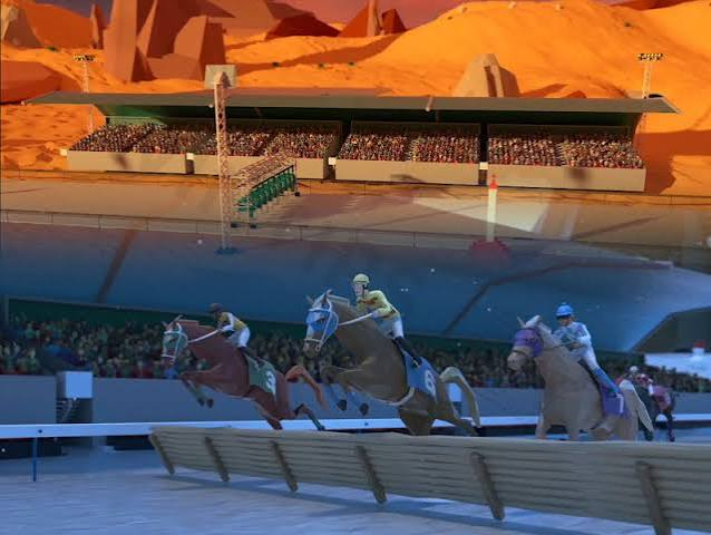
Horse racing pages deal with a demanding user journey. Visitors often arrive shortly before an event, want several facts at once, and have little patience for unclear navigation. They need to identify the race, compare runners, check the start time, and understand the latest status without searching through unrelated content.
The same expectations apply when users open this website to explore online gaming. A platform may offer many options, yet its value depends on how quickly people can understand what is available and decide where to go next. Horse racing interfaces offer useful lessons because they organize dense, time-sensitive information around immediate user intent.
The Main Question Deserves the Strongest Position
A well-structured racing page begins with the event. The venue, race number, scheduled time, runners, and current status form the center of the experience. Supporting details appear around that core rather than competing with it.
Online gaming platforms often face the opposite problem. Promotions, banners, menus, categories, and account prompts can all demand attention at once. The user sees many possible actions but receives little help choosing the first one.
A clearer hierarchy should answer three questions immediately. What is happening now? What can the user open? What information is needed before making a choice? Once those answers are visible, secondary tools become easier to understand.
Time Sensitive Information Needs Visible Status
Horse racing changes according to a clear schedule. A race can be upcoming, delayed, underway, or complete. Each state changes what the visitor needs from the page.
Gaming platforms also contain changing states. A live activity may be available, paused, loading, closed, or waiting for the next round. Vague labels force users to guess whether a delay comes from the platform, their connection, or the event itself.
Useful status design should include:
- A clear label showing whether an activity is live, upcoming, or finished.
- Start times displayed in a consistent format.
- Visible loading feedback when data is being retrieved.
- A direct explanation when an activity becomes unavailable.
- Updated results placed close to the original event.
These details reduce unnecessary taps and repeated page refreshes. They also give users a better sense of control.
Dense Data Should Be Organized Around Decisions
A race card can contain many details, including runner names, post positions, recent form, jockey information, and changing prices. Displaying everything with equal emphasis would make the page difficult to scan. Useful interfaces group related information and reveal greater depth only when the visitor asks for it.
Online gaming pages can apply the same approach. The first view should contain the information needed for a basic decision. Detailed rules, histories, statistics, or additional settings can remain one step away.
Expandable sections work well when their labels are precise. A button marked “More details” offers little direction. Labels such as “Game rules,” “Previous results,” or “Session limits” tell the user exactly what will open.
The goal is not to hide information. It is to present it in an order that reflects how people evaluate options.
Comparison Should Require Less Memory
Racing visitors frequently compare several runners before settling on one view of the event. A difficult interface forces them to open separate pages, remember numbers, and move backward repeatedly. A useful one keeps comparable details aligned.
Gaming platforms can reduce the same mental workload. Similar activities should use consistent card layouts, terminology, button positions, and data formats. When every section follows a different structure, users spend more effort learning the interface than assessing the content.
Slot Desi can support faster comparison by keeping related options visually consistent. Users should be able to identify differences without reopening several screens or remembering where each detail appeared.
Consistency also makes unfamiliar content easier to approach. Once users understand one card or category, that knowledge should help them interpret the next one.
Mobile Design Must Respect Short Visits
Many racing page visits happen with a narrow purpose. A person may check a start time, review one runner, or look for a result before leaving. The interface must serve that task without demanding a long session.
Online gaming users also arrive in different situations. Some have time to browse. Others open a page briefly while commuting, waiting, or switching between other activities. A mobile layout should work for both behaviors.
The opening screen should provide useful information before every image and secondary module has loaded. Important controls need enough space for accurate tapping. Pop-ups should never cover the current status or the main route back to navigation.
Long pages require persistent orientation. A compact header, visible category name, or stable return button helps users understand where they are after scrolling through several sections.
Trust Grows Through Predictable Feedback
Horse racing pages manage information that can change quickly. A result may arrive, a schedule may move, or a runner may be removed. The interface needs to show these changes without leaving old information visible in another section.
Gaming platforms face a similar responsibility. When a user taps a control, opens an activity, or changes a setting, the system should confirm what happened. Unclear feedback encourages repeated actions and creates uncertainty about the current state.
Good feedback is specific. Instead of a generic message such as “Something went wrong,” the page should explain whether the connection failed, the content closed, or the request needs to be repeated. A successful action should also be confirmed without blocking the next step.
Slot Desi does not need to copy the visual style of a racing site. The useful lesson lies in predictable updates, visible states, and clear responses to every action.
A Better Platform Helps Users Choose Their Next Step
Horse racing pages work under pressure because the event schedule gives every piece of information a purpose. The strongest designs keep the race at the center, arrange supporting data around user decisions, and make changing states easy to recognize.
Online gaming platforms can follow the same logic. A large content library becomes easier to use when categories are consistent, status messages are specific, and deeper information appears at the right moment.
The quality of the experience depends less on how many elements fit on the screen and more on whether each one helps the user move forward. Clear priorities reduce hesitation. Stable layouts reduce effort. Honest feedback prevents confusion.
A platform succeeds when visitors can understand the current state, compare available options, and choose the next action without fighting the interface. Horse racing pages have been solving that problem for years, which makes their structure a useful reference for online gaming design.
